Journal / Digital · 30 Jul 2026 · 6 min read
What a ceramics shop taught us about checkout
We cut Kiln & Co.'s checkout from five screens to two. Revenue tripled. Here is what we removed and why.
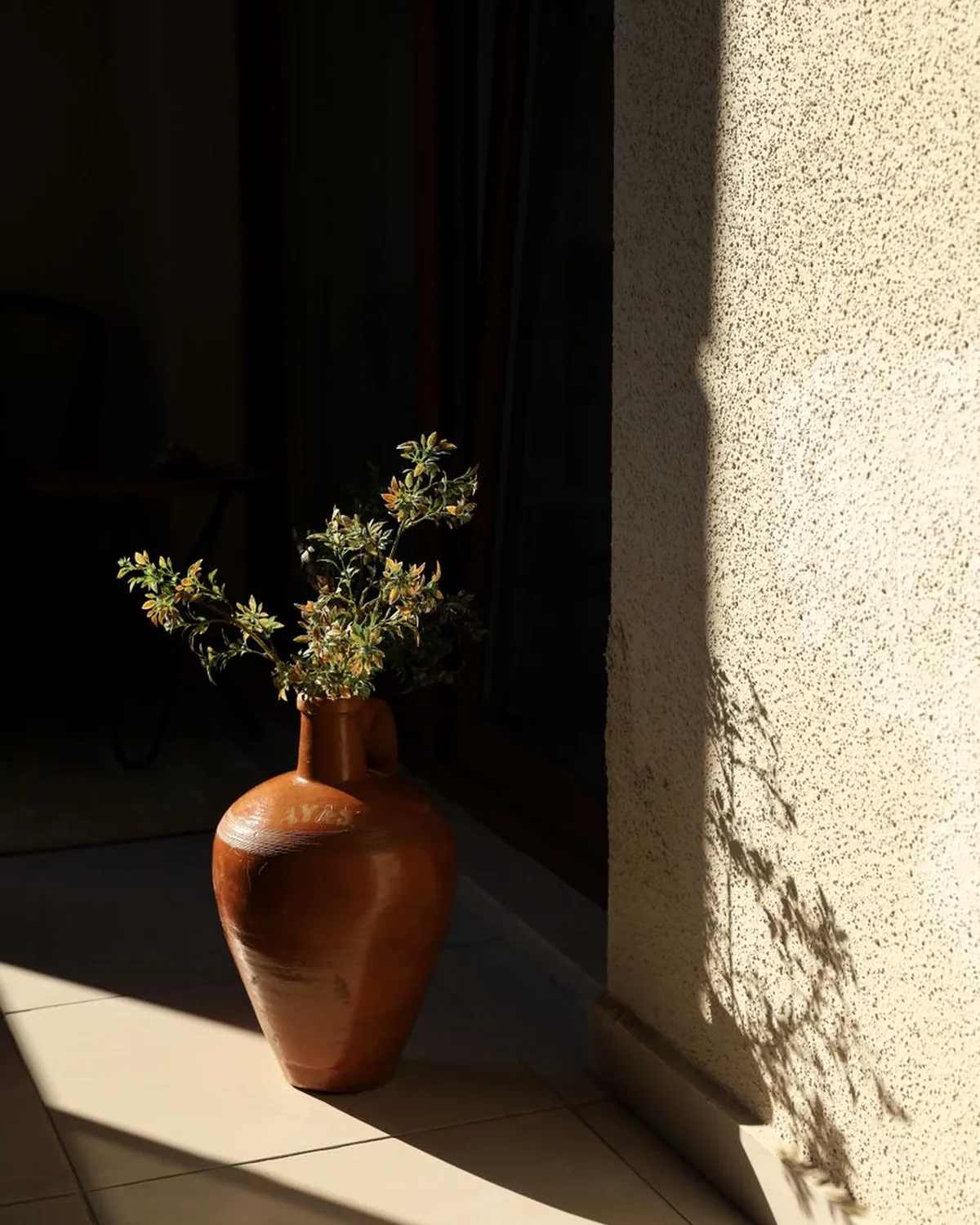
Kiln & Co. made beautiful things and sold them through an ugly funnel. Five screens, two account prompts and a shipping calculator that appeared only at the very end.
We started by watching ten customers try to buy a bowl. Seven of them gave up. Every one of them gave up at a different screen.
The fix was not clever. Ask for the email first, show shipping on the product page, and collapse address and payment into one step. Guest checkout by default. No surprises.
The lesson we keep relearning: good digital design is mostly subtraction. The exciting part of the Kiln site is the photography and the slow scroll. The part that made the money was the boring part we deleted.
Keep reading