Work / Grid Athletics
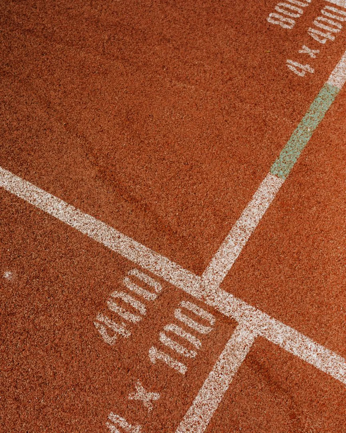
A track and field club identity built on the lines already painted on every track.
01 — The challenge
A club with Olympic-level coaching and a logo that looked like clip art.
02 — Our approach
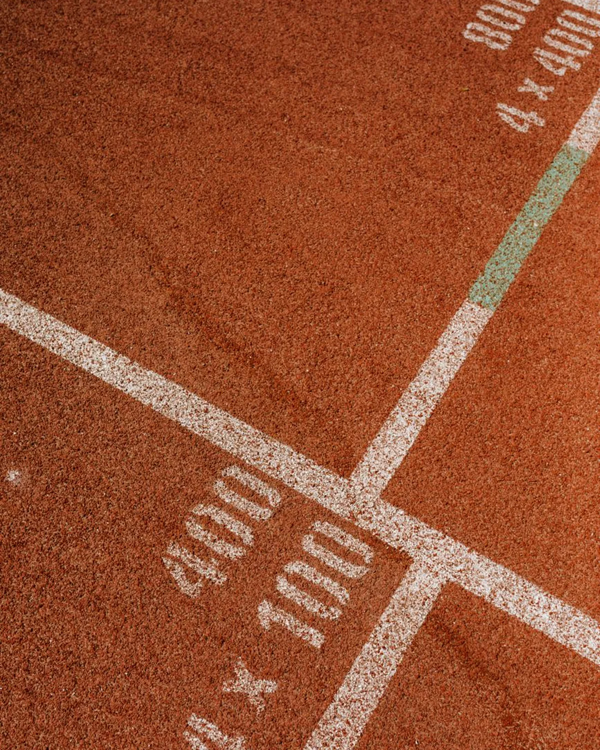
We took the lane line as the brand: a grid mark, numerals drawn on the track's geometry, kit graphics that read at 100 metres and animated race-day graphics for the scoreboard.
03 — The outcome
Membership enquiries doubled in the season after launch and the kit sold out twice.
2×membership enquiries


What we delivered
- 01identity
- 02sport
- 03motion
- 04Guidelines
- 05Launch assets
People recognise our athletes from the far end of the stadium now. The kit sold out twice before the season started.