An identity fired twice
A full identity system for a Bengaluru ceramics studio: wordmark, type, colour, voice and packaging that feels as considered as the pots.
- (Client)
- Saanjh Ceramics
- (Industry)
- Craft & retail
- (Duration)
- 9 weeks
- (Scope)
- Identity, Packaging, Art direction
Where they were
Saanjh's pottery sold out at weekend markets but the brand was a hand-drawn logo and a WhatsApp number. They were opening a flagship in Jayanagar and taking on hotel orders, and needed to look like the studio they had become.
What we did
We studied the kiln: the marks a firing leaves, the cracks in the glaze, the way stacks of bowls cast shadows. The wordmark is cut from a single brush stroke, the palette comes from six of their glazes, and the packaging is uncoated board stamped by hand in the studio.
What happened
The flagship opened with a waitlist, three hotel groups signed tableware contracts in the first quarter, and wholesale enquiries rose 3.4 times.
Listening to the kiln
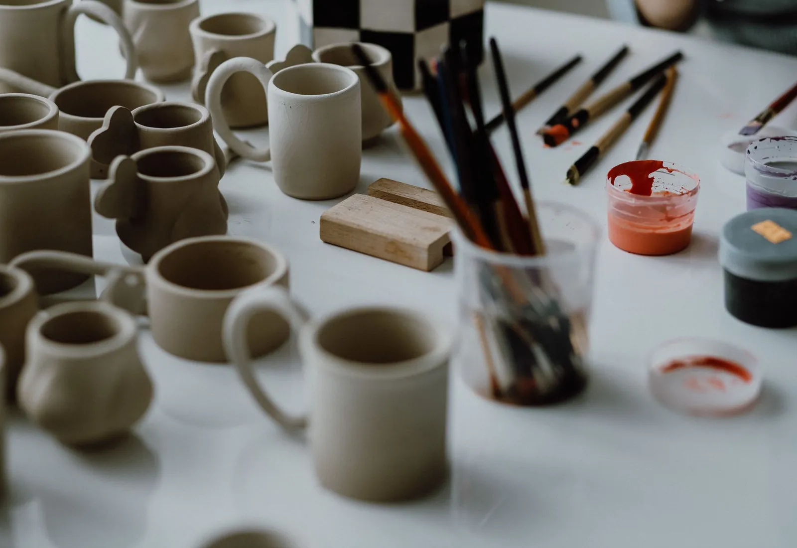
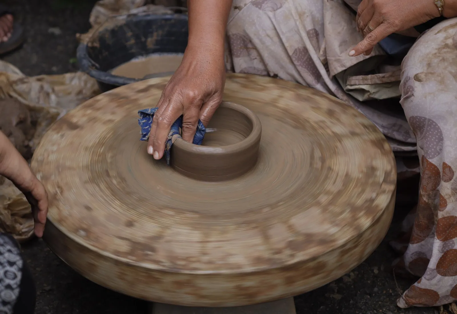
We spent two firings in the studio in Banashankari, photographing every stage from wet clay to cooled glaze. The cracks, drips and fingerprints became the brand's visual language.
Glaze tests, brush-stroke studies and the first packaging prototypes.

“They understood the pots before they touched the logo. The brand finally looks like the work.”
Nandini Rao, Founder, Saanjh Ceramics
- Creative direction
- Meera Iyer
- Identity design
- Kavya Menon
- Packaging
- Kavya Menon, Ishaan Kulkarni
- Photography
- Northform Studio
What changed.
Ledgerly