Accounting that reads like a sentence
An end-to-end redesign of a GST and bookkeeping platform for small Indian businesses, from onboarding to month-end close.
- (Client)
- Ledgerly
- (Industry)
- Fintech SaaS
- (Duration)
- 16 weeks
- (Scope)
- Product design, Design system, SaaS

Where they were
Ledgerly had 40,000 sign-ups and a 9% activation rate. Owners opened the dashboard, saw forty columns of ledger codes and called their CA instead.
What we did
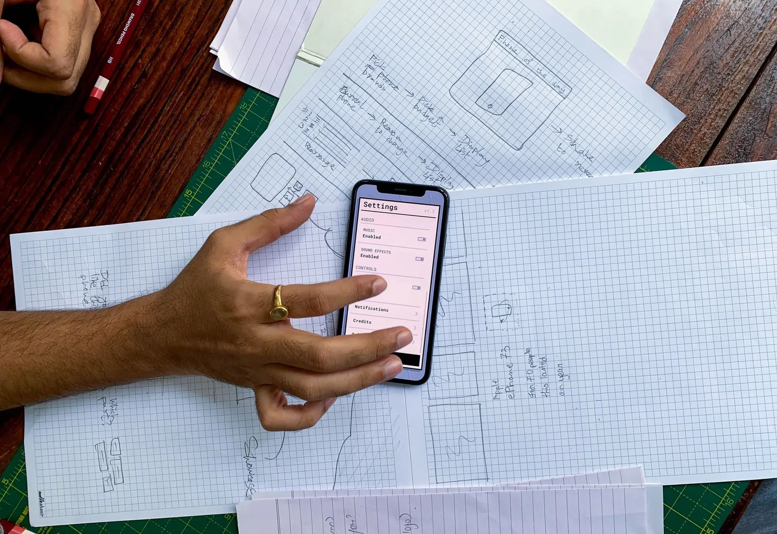
Six weeks of research with kirana owners, salon chains and D2C founders in Bengaluru and Pune. We rebuilt the product around one question per screen, wrote every label in plain English and Hindi, and shipped a 140-component design system the team now builds with.
What happened
Activation climbed from 9% to 31% in two releases and support tickets per account fell by half.
One question per screen
Every flow was rewritten as a conversation: what did you sell, who paid, what do you owe. The ledger is still there for accountants, one tap away.
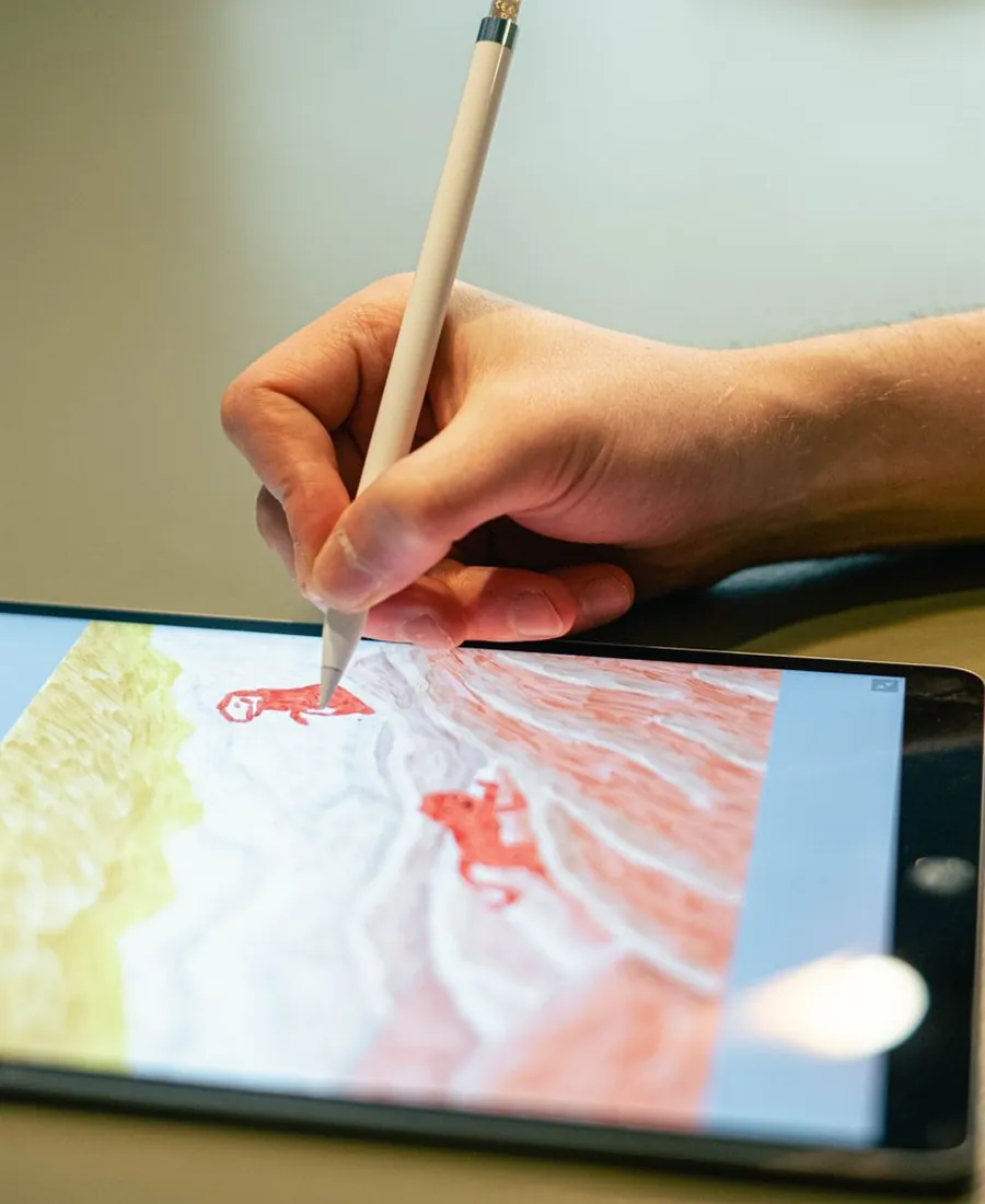
Paper flows, research sessions and the design system in use.

“Northform didn't just redesign the screens. They changed how our whole team talks about the product.”
Siddharth Jain, CPO, Ledgerly
- Product design lead
- Arjun Shetty
- Research
- Kavya Menon
- Design system
- Rohan Pillai
- Strategy
- Meera Iyer
What changed.
Kora Health