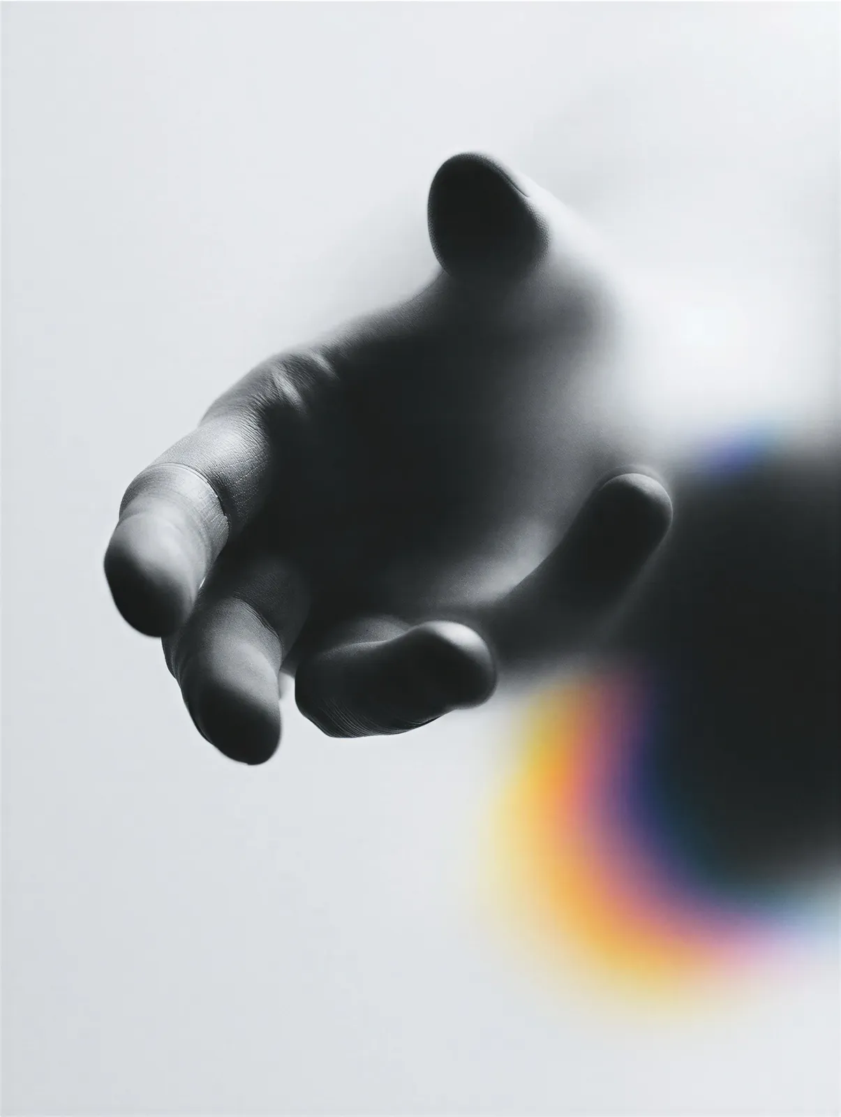

CHEAP BRANDS ADD. EXPENSIVE BRANDS REMOVE. HERE IS WHY RESTRAINT IS THE ACTUAL VISUAL LANGUAGE OF LUXURY, AND HOW TO DESIGN FOR PREMIUM WITHOUT FALLING INTO THE TRAPS MOST AGENCIES FALL INTO THE MOMENT THE WORD PREMIUM APPEARS ANYWHERE IN THE BRIEF.
WHAT MOST AGENCIES THINK PREMIUM MEANS
When premium shows up in a brief, most agencies start layering. Gradients. Oversized serifs. Gold foil. Marble backgrounds. Moody photography. Product renders with soft shadows. All of those signals are supposed to say luxury, and none of them actually do.
The reason they fail is that they are performing luxury rather than embodying it. Real luxury brands almost never look like moodboards of luxury brands. They are quieter, cleaner, and more restrained than the agencies briefed to imitate them.
WHY RESTRAINT READS AS EXPENSIVE
Expensive works because of what it does not do. It does not fill every corner. It does not over-explain. It does not perform. The word luxury appears nowhere on a luxury site because it does not have to. The brand is confident enough not to need to say it.
Restraint signals confidence, and confidence signals value. A brand that trusts a single photograph and a single sentence to carry a whole homepage reads as more premium than a brand that layers five moments trying to prove it deserves the price.
THE TRAP OF THE MOODBOARD
Most premium briefs get killed at the moodboard stage. The client sends references. The references are all layered. The moodboard becomes a synthesis of a dozen busy looks. The final work is a slightly busier version of the busiest reference. Nothing about the process points toward restraint.
Our approach on premium projects is to remove first, add later. Strip the site to almost nothing. Design the one thing worth showing. Add only what the composition genuinely needs. Most of the time, we do not add much.
WHAT SMALL-LOOKS-EXPENSIVE ACTUALLY LOOKS LIKE
One photograph, treated large. One sentence, treated with confidence. Space around both. That is the whole formula. The most premium moment on any site is the empty space around the one thing worth looking at. Everything else is decoration, and decoration is what makes a brand look cheaper than it actually is.