← Journal
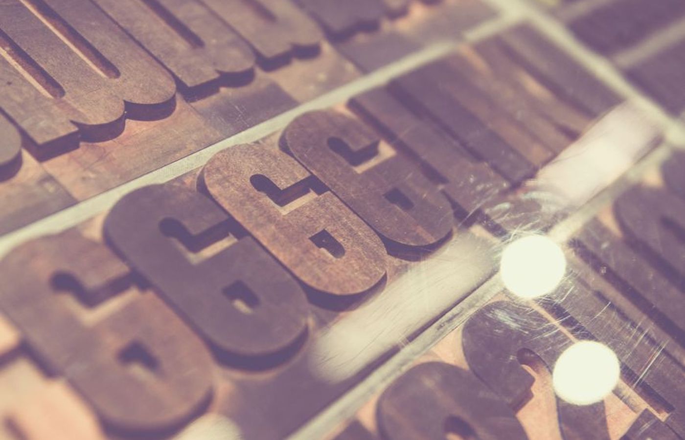
Pairing a serif with a working sans
Our favourite identities are carried by type before colour or logo. Here is how we pair a characterful serif with a hard-working sans.
Give the serif one job The serif speaks in headlines, a word or two in italic for emphasis. It never sets a paragraph.
Let the sans do the work Navigation, captions, prices and forms all sit in a neutral sans with generous spacing. It should be invisible.
Test at the smallest size first A pairing that looks beautiful at 120px and falls apart at 12px is not a pairing. We print every proof at caption size before we sign it off.
Written by Jun Park