SECOND SKIN
A FLAGSHIP FOR A SKINCARE LINE BUILT AROUND TOUCH, NOT CLAIMS.

Étoile Blanche's body butter uses a handful of ingredients at real concentration, in a category that sells on long claim lists and clinical white packaging. We built the packaging system and digital flagship around restraint — sold on how the product feels, not what it promises.
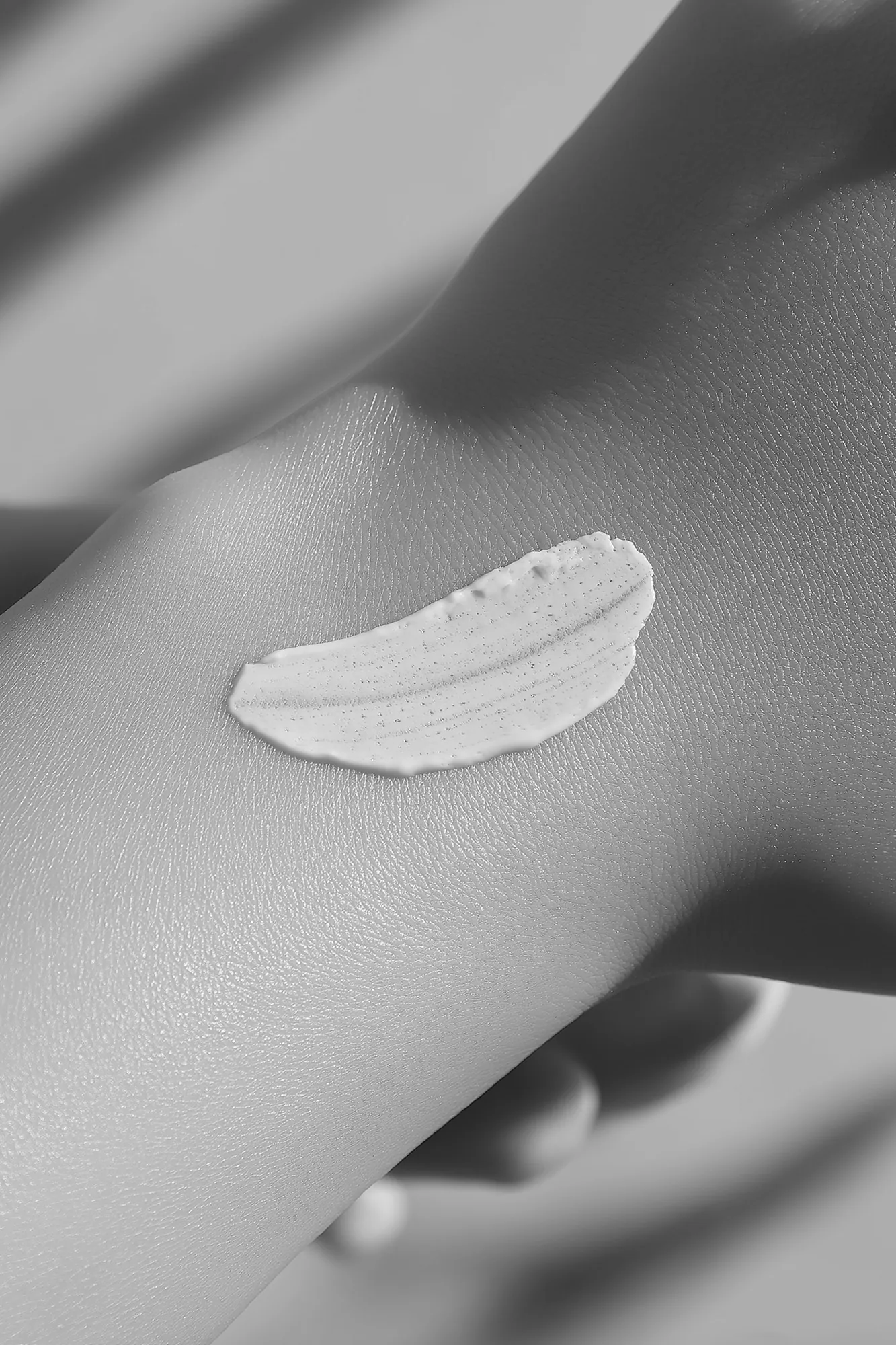
A single matte-black format, minimal type, and campaign photography built around touch. Claims moved off the packaging entirely and onto one ingredient page, reached only by visitors who go looking. The product is made to disappear into the skin; the brand was built to do the same.


THE FORMULA WITHOUT THE NOISE
Luxury skincare mostly sells on ingredient claims stacked across a page until none of them mean anything.
Étoile Blanche's body butter is formulated around a small number of ingredients used at real concentration, which put it at odds with a category built on long claim lists and clinical-white packaging. The brand risked disappearing into the same shelf it was trying to stand apart from.
We needed a system that could carry a luxury price point on tactility and restraint alone, without falling back on the ingredient-panel marketing the brand was actively moving away from.
THE TOUCH WITH RESTRAINT
A monochrome identity and packaging system built to be felt before it's read.
We moved the brand to a single matte-black packaging format with minimal type, then built campaign photography around touch — hands, texture, the product held rather than displayed. Claims moved off the primary packaging entirely and into a single ingredient page on the flagship site, reached only if a visitor goes looking for it.
The digital flagship carries the same restraint: one product per screen, generous space, checkout reached in two steps. The site sells the way the packaging does — by getting out of the way.

FELT FIRST, THEN BOUGHT
The flagship launched with one product per screen and no ingredient claims above the fold — and passed the brand's first-quarter projections inside eight weeks.
Against the previous storefront over the first quarter
Within 60 days of a first order
Buyers who visited the one page where the claims now live
The packaging format has since carried two further products without a single new design decision.
In a category that talks constantly, the quiet brand was the one people remembered.